
Best Countries for Digital Nomads in 2026 (Based on Real Constraints, Not Instagram)
Remote work didn’t just “change where we work.” It changed what a life plan looks like. In 2026, the question…
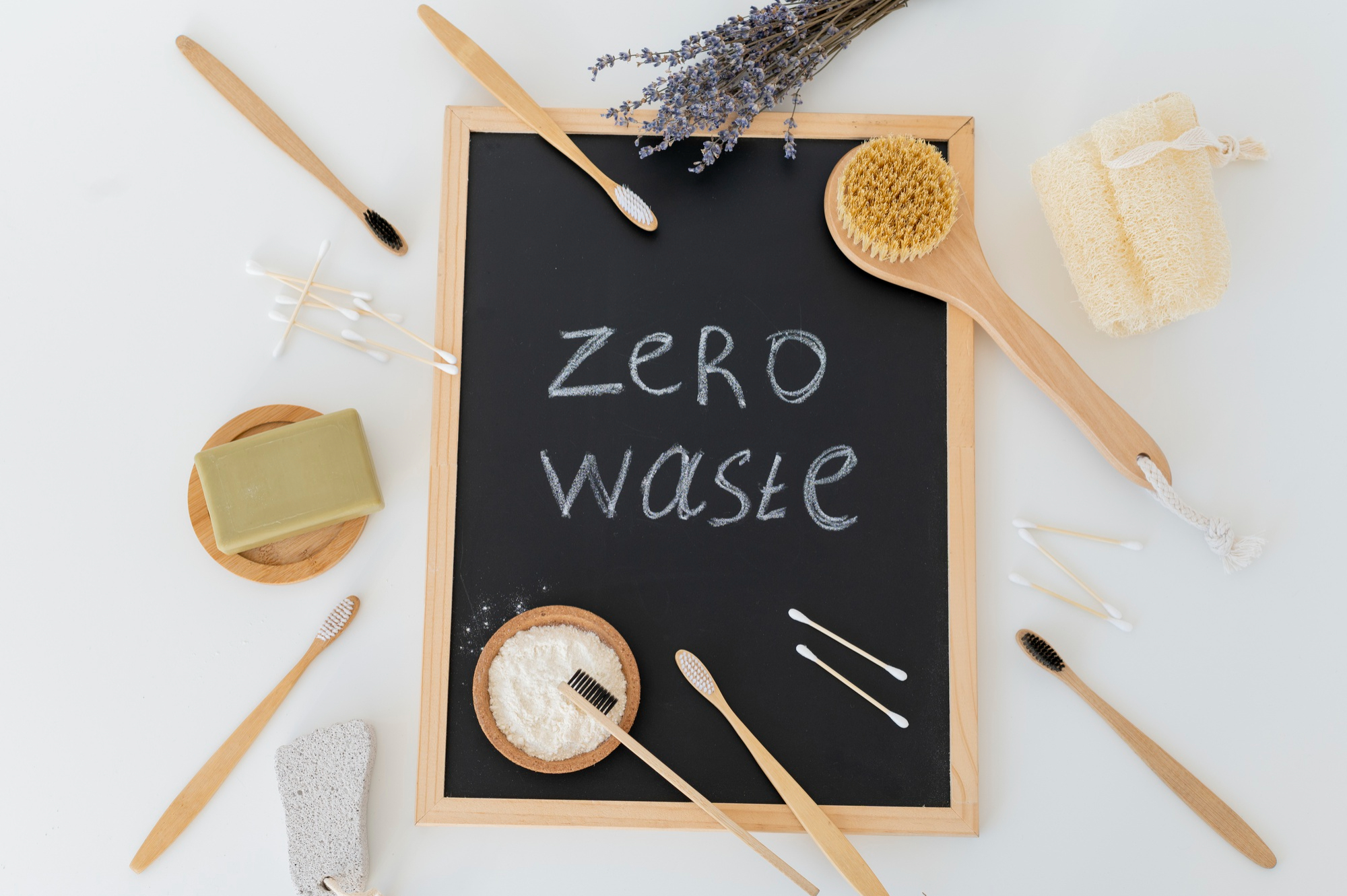
Zero-Waste Lifestyle Hacks in 2026
The 2026 reality: “zero-waste” isn’t a vibe anymore — it’s a workflow A few years ago, zero-waste content was mostly…
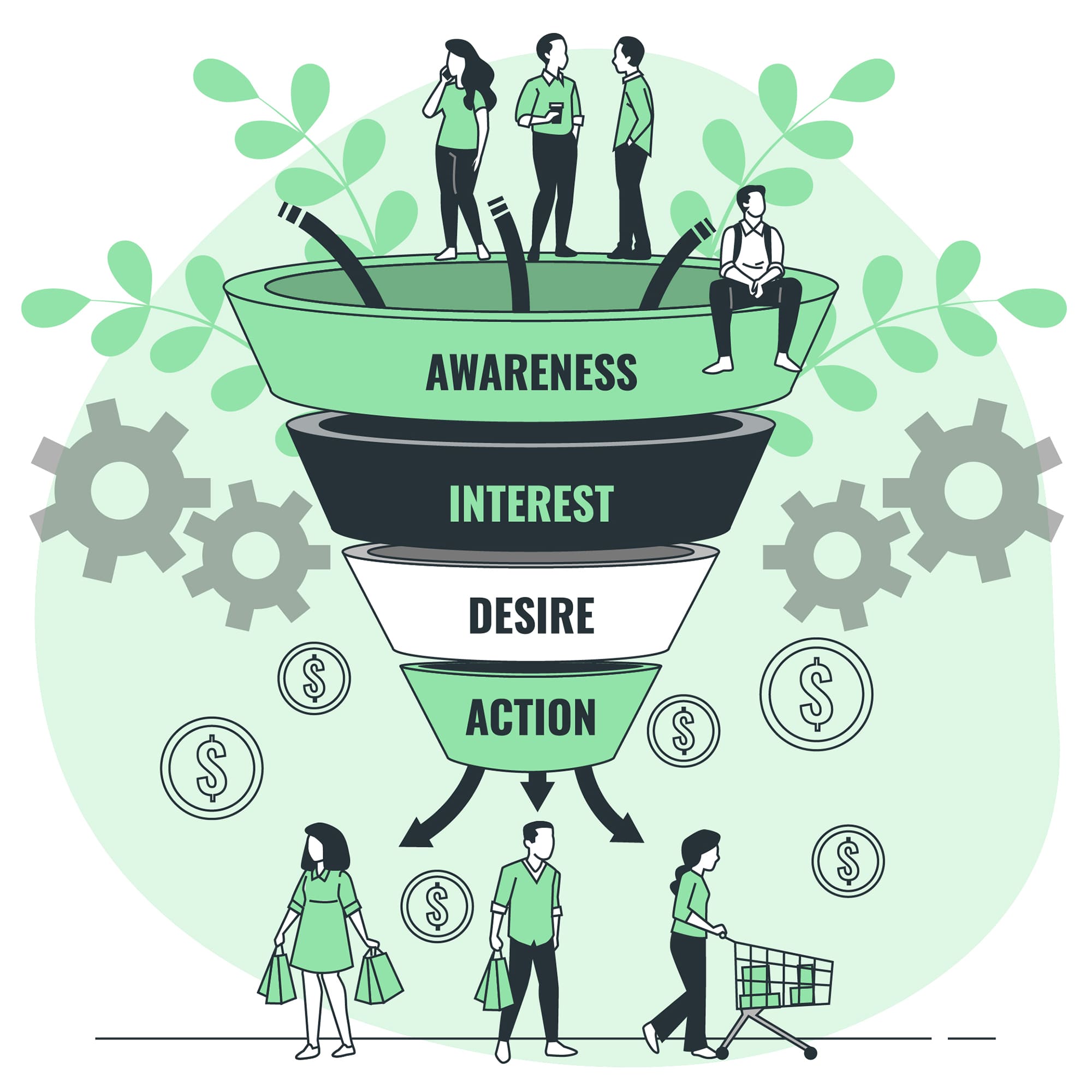
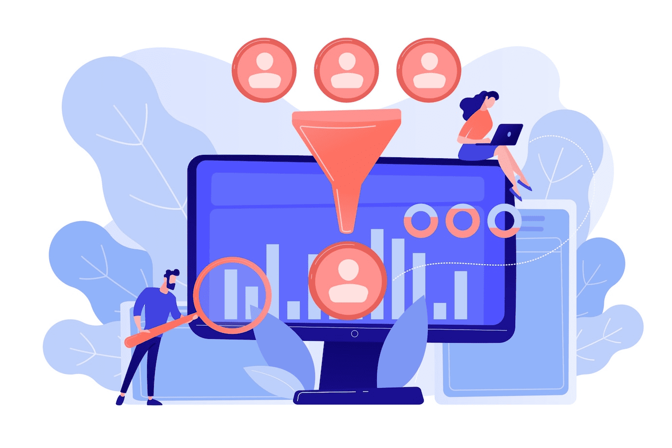
How to Attract Customers at the Awareness Stage of the Funnel: A Comprehensive Guide
It was 2:30 AM when Sarah finally admitted defeat. Her small jewelry business had a beautiful website, unique products, and…
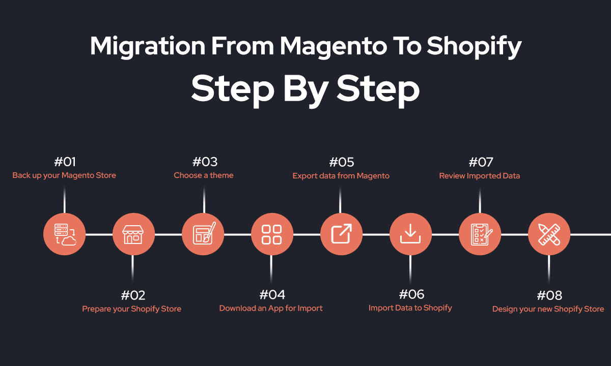
How to Migrate Your Store from Magento to Shopify: A Complete Guide
In the fast-paced world of e-commerce, adaptability is not just a strength—it’s a necessity. Over the past decade, businesses have…
Optimizing Your Shopify Product Pages for Higher Conversion Rates
Imagine walking into a brick-and-mortar store, spotting a product you like, but struggling to find any helpful information. The lighting…

How AI Is Reshaping Modern Workflows — And Why Most Teams Are Still Doing It Wrong
AI Didn’t Change Work — It Exposed How Broken It Already Was AI didn’t arrive to revolutionize work. It arrived…
How to Migrate from WooCommerce to Shopify in 5 Simple Steps
So, your online store, built with the trusty WooCommerce, has been your digital workhorse. It’s served you well, gotten you…
The Ultimate Guide to Converting Figma Designs into Shopify Themes
I still remember the first time I tried converting a Figma design to a Shopify theme. What I thought would…
How to Convert Leads at the Decision Stage of the Funnel: The Ultimate Guide to Closing More Sales
At the decision stage of your sales funnel, potential customers are on the verge of making a purchase.They’ve recognized their…
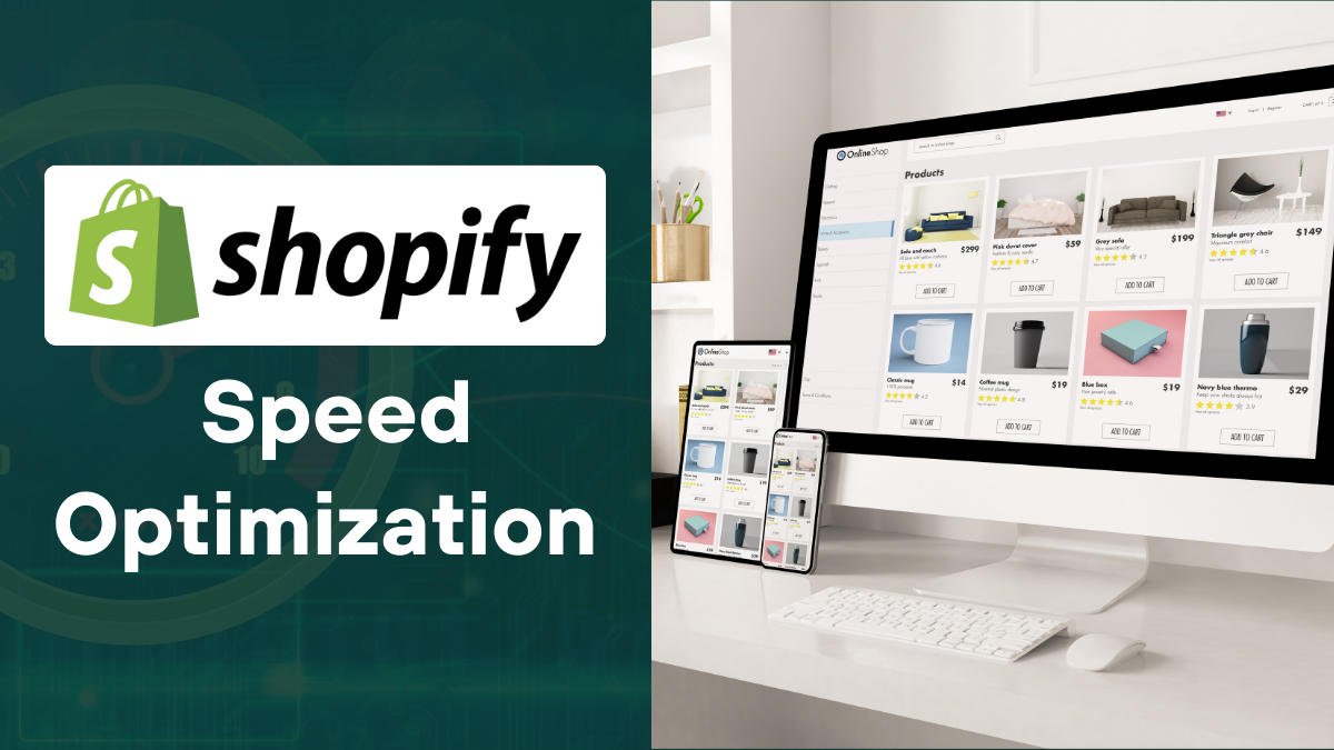
How to Optimize Your Shopify Store for Better Conversions
Getting people to visit your Shopify store is just the beginning. The real success comes from turning those visitors into…